
The Art of Credibility: Foundations of a Convincing Photoshop Composition
Photoshop composition is not just the technical assembly of parts — it is the creation of a visual illusion that feels both intentional and believable. Whether surreal, symbolic, or photorealistic, a strong image depends on several foundational principles. Each of these will be explored in future blog entries, beginning with the most structural of them all: perspective. The Concept (Item #1 will be addressed in future posts).
1. Concept and Storytelling
Every meaningful image begins with an idea. The concept — whether poetic, psychological, or narrative — provides coherence and depth. It’s the compass that guides every compositional choice. But for now, we’ll set the concept aside and return to it in a future post. Before ideas can breathe, they need a stage to exist upon. That stage is space — and space begins with perspective.
Every meaningful image begins with an idea. The concept — whether poetic, psychological, or narrative — provides coherence and depth. It’s the compass that guides every compositional choice. But for now, we’ll set the concept aside and return to it in a future post. Before ideas can breathe, they need a stage to exist upon. That stage is space — and space begins with perspective.
2. Perspective and Scale
This is where our series begins. Perspective defines how space is perceived, how objects relate in size and position, and how the viewer’s eye is led through the frame. It governs vanishing points, horizon lines, and the spatial logic of the image. Misaligned perspectives — a figure tilted against the plane of the background, a doorway that shrinks unnaturally — instantly disrupt believability.
For that reason, we begin with perspective: it is the grammar of visual truth.
3. Consistent Lighting
Light models form and unifies space. For a composite to feel seamless, all elements must respond to the same light source — in angle, intensity, direction, and shadow. One mismatched shadow can unravel an entire illusion.
Light models form and unifies space. For a composite to feel seamless, all elements must respond to the same light source — in angle, intensity, direction, and shadow. One mismatched shadow can unravel an entire illusion.
4. Edge Treatment and Blending
Edges reveal whether an object belongs. If they’re too sharp, they scream “cut-out”; too soft, they fade away. Seamless integration requires precise masking and transitions — sometimes even adding shared texture or color noise.
Edges reveal whether an object belongs. If they’re too sharp, they scream “cut-out”; too soft, they fade away. Seamless integration requires precise masking and transitions — sometimes even adding shared texture or color noise.
5. Depth and Atmosphere
A compelling image breathes in layers. Foreground, midground, and background must be differentiated, often with blur, haze, or light diffusion. Atmospheric perspective is not just a technical tool — it’s emotional space.
A compelling image breathes in layers. Foreground, midground, and background must be differentiated, often with blur, haze, or light diffusion. Atmospheric perspective is not just a technical tool — it’s emotional space.
6. Color Harmony
Color binds the parts into a whole. A shared palette enhances mood, clarity, and flow. Discordant tones fragment attention; harmonious ones invite it in.
Color binds the parts into a whole. A shared palette enhances mood, clarity, and flow. Discordant tones fragment attention; harmonious ones invite it in.
Each of these elements contributes to the believability of a Photoshop composition. In this blog series, we’ll examine them one by one — beginning with perspective, the silent architecture that holds the image together.
How “The Fall” Was Created — A Behind-the-Scenes Walk-through
After shaping the concept of The Fall — a symbolic plunge through a collapsing reality — it was time to bring the vision to life through staged photography and compositing.
The Importance of Perspective
One of the most critical — and non-negotiable — elements of compositing is perspective. Once the shot is taken, perspective cannot be convincingly corrected. This is why the photography phase must be approached with the final scene in mind.

I staged the photo in my living room. Knowing the orientation I wanted, I mounted my camera on a tripod, carefully chose the camera angle, slightly low, above my head, to mimic the perspective of someone falling into the scene. The scarf was styled to suggest midair motion, and I took care to keep the light soft and diffuse — easily adjustable later, but not contradictory to the imagined background. Additionally, you can see my cellphone in the image. It has a remote-control, time delay, scene-display application, which I use to make sure I capture the right image.
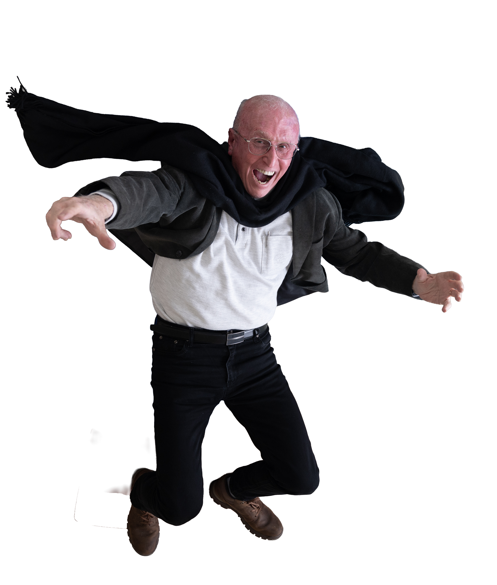
After selecting the best frame, I removed the background and rotated the subject 180 degrees to convey the sense of upside-down descent. You can see here how much the body posture, scarf movement, and hand placement contributed to the illusion of falling. Note: nothing here was simulated or warped — the pose is real.
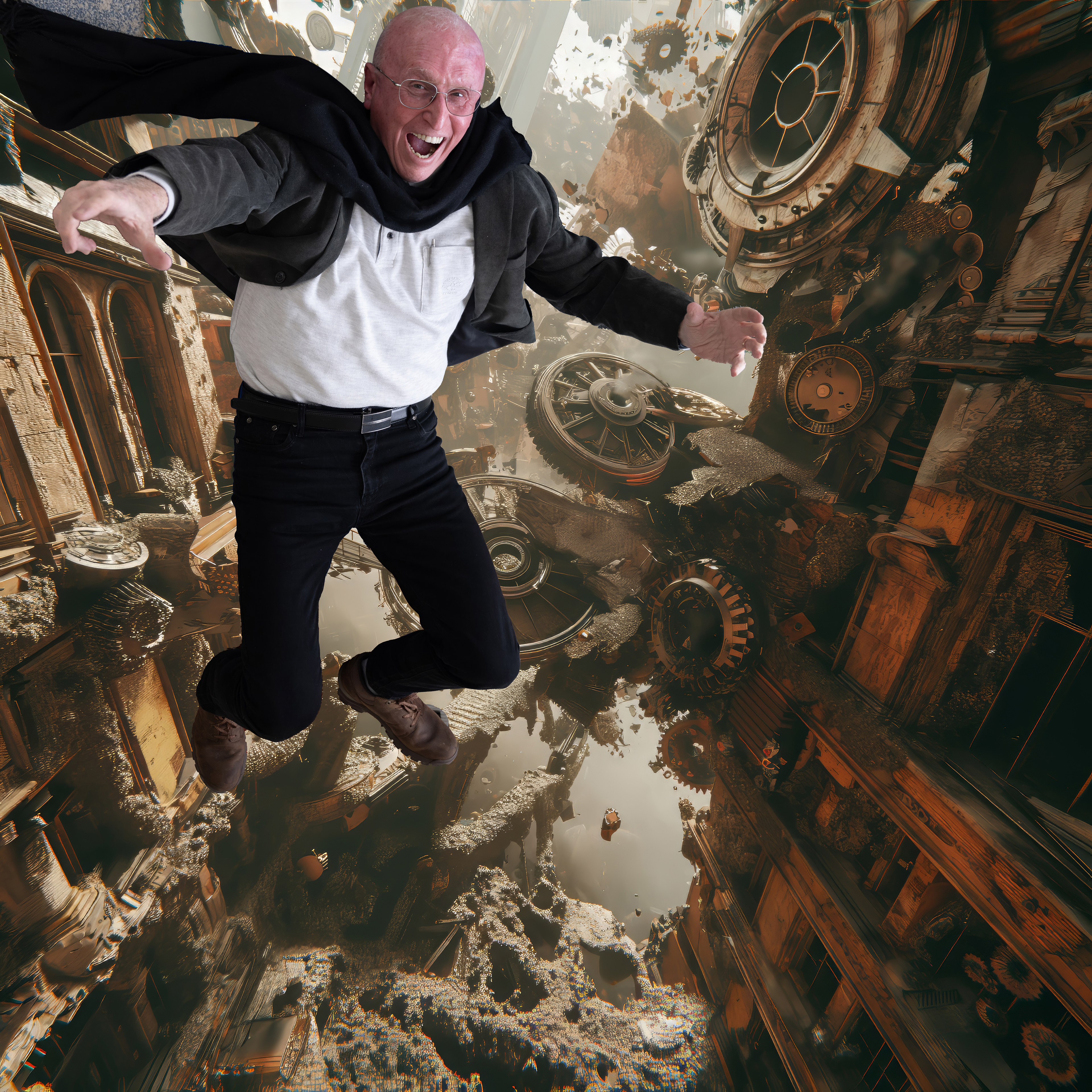
Now the cut-out figure is placed into the background layer, which is a digitally constructed environment of crumbling buildings, floating gears, and melting clock faces. The background’s perspective — a tilted vanishing point that draws the eye downward and to the right — had already been matched in-camera during the shoot. This harmony in vanishing angles is what makes the integration work.
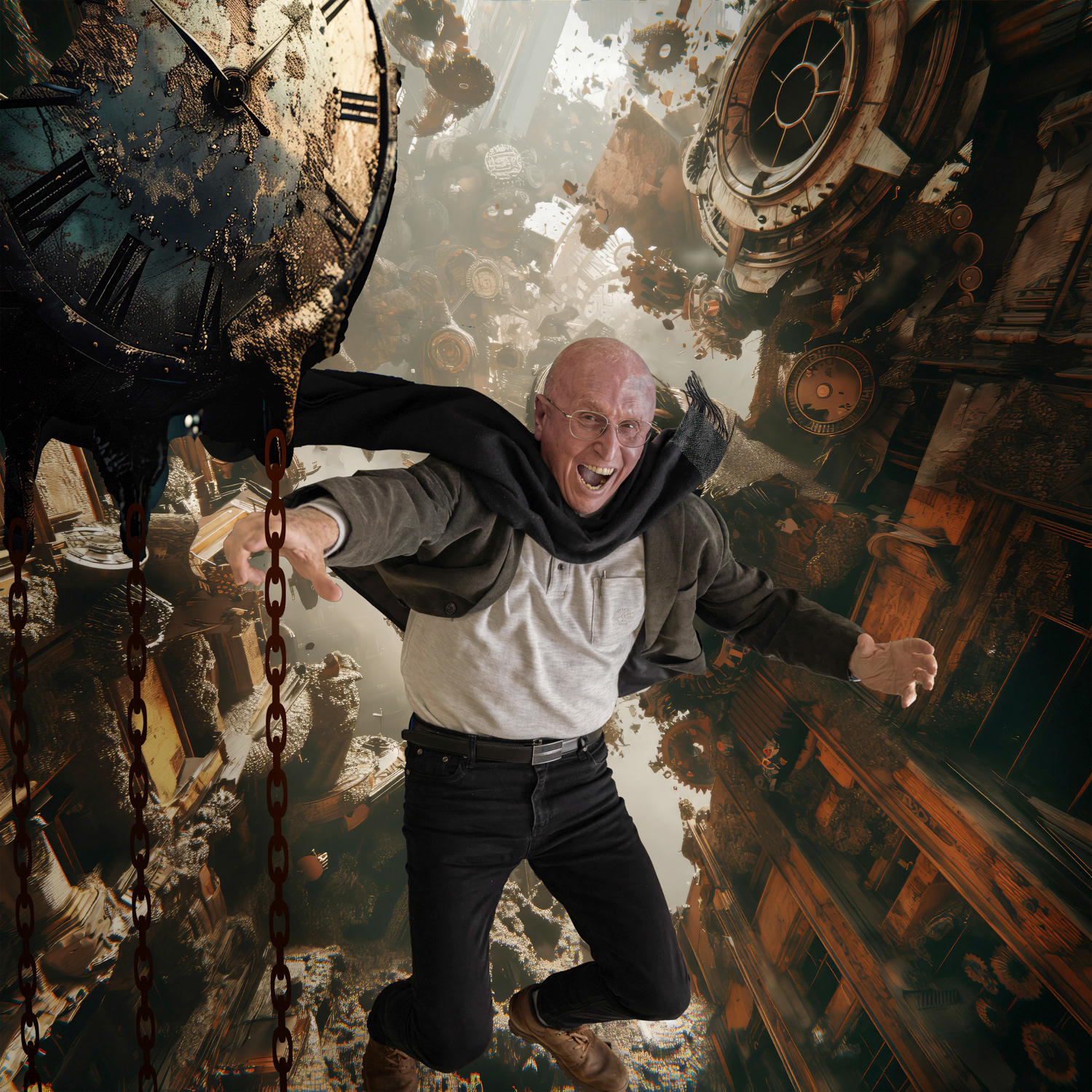
In the finished version, additional elements are added (for example, a rusting clock, and fine chain elements to enhance depth), together with subtle color grading for warmth and decay, shadow casting for integration, etc. The result is a moment frozen between gravity and symbolism — falling into the abyss in a collapsing environment.
In future posts, we’ll dive into additional stages: concept, lighting alignment, edge blending, creating atmospheric depth, etc.
But it all begins with perspective — the invisible ruler by which visual truth is measured.
Your Thoughts Are Welcome
If you have any comments, questions, insights, or reflections about this post — I’d love to hear them.
Please use the related image post on my Instagram to join the conversation. That’s where dialogue happens
If you have any comments, questions, insights, or reflections about this post — I’d love to hear them.
Please use the related image post on my Instagram to join the conversation. That’s where dialogue happens
אמנות האמינות: יסודות לקומפוזיציית פוטושופ משכנעת
קומפוזיציהה בפוטושופ איננה רק חיבור טכני של רכיבים — זוהי יצירת אשליה חזותית שמרגישה גם מכוּונת וגם אמינה. בין אם מדובר בדימוי סוריאליסטי, סימבולי או פוטו-ריאליסטי, עוצמתו נשענת על כמה עקרונות יסוד. כל אחד מהעקרונות ייסקר בפוסטים עתידיים, החל מהמבני ביותר: הפרספקטיבה. במושג ה- "קונספט" (רעיון) נדון בפוסטים הבאים.
רעיון וסיפוריות
כל דימוי משמעותי מתחיל ברעיון. הרעיון — יהיה פיוטי, פסיכולוגי או נרטיבי — מעניק לכידות ועומק; הוא המצפן שמכוון כל החלטה קומפוזיציונית. אך כעת נדחה את העיסוק ברעיון ונחזור אליו בהמשך. לפני שהרעיון יכול “לנשום”, הוא זקוק לבמה להתקיים עליה. הבמה היא החלל — והחלל מתחיל בפרספקטיבה.
כל דימוי משמעותי מתחיל ברעיון. הרעיון — יהיה פיוטי, פסיכולוגי או נרטיבי — מעניק לכידות ועומק; הוא המצפן שמכוון כל החלטה קומפוזיציונית. אך כעת נדחה את העיסוק ברעיון ונחזור אליו בהמשך. לפני שהרעיון יכול “לנשום”, הוא זקוק לבמה להתקיים עליה. הבמה היא החלל — והחלל מתחיל בפרספקטיבה.
פרספקטיבה וקנה־מידה
כאן מתחילה הסדרה שלנו. הפרספקטיבה מגדירה כיצד נתפס החלל, כיצד משתרעות צורות בגודל ובמיקום, וכיצד העין מנווטת בתוך הפריים. היא קובעת נקודות מגוז, קווי אופק ואת ההיגיון המרחבי של התמונה. פרספקטיבה משובשת — דמות נטויה ביחס לרקע, דלת שמתכווצת באופן לא טבעי — פוגעת מייד באמינות. לכן נפתח בפרספקטיבה: היא הדקדוק של האמת החזותית.
כאן מתחילה הסדרה שלנו. הפרספקטיבה מגדירה כיצד נתפס החלל, כיצד משתרעות צורות בגודל ובמיקום, וכיצד העין מנווטת בתוך הפריים. היא קובעת נקודות מגוז, קווי אופק ואת ההיגיון המרחבי של התמונה. פרספקטיבה משובשת — דמות נטויה ביחס לרקע, דלת שמתכווצת באופן לא טבעי — פוגעת מייד באמינות. לכן נפתח בפרספקטיבה: היא הדקדוק של האמת החזותית.
תאורה עקבית
האור מעצב צורה ומאחד חלל. כדי שקומפוזיציה תרגיש נטולת תפרים, כל הרכיבים חייבים להגיב לאותו מקור אור — בזווית, בעוצמה, בכיוון ובצל. צל אחד שאינו מתאים עלול לפרק את האשליה כולה.
האור מעצב צורה ומאחד חלל. כדי שקומפוזיציה תרגיש נטולת תפרים, כל הרכיבים חייבים להגיב לאותו מקור אור — בזווית, בעוצמה, בכיוון ובצל. צל אחד שאינו מתאים עלול לפרק את האשליה כולה.
טיפול קצוות ומיזוג
הקצוות חושפים אם אובייקט שייך לסצנה. חדים מדי — הם צורחים “גזירה”; רכים מדי — הם מתפוגגים. שילוב נטול תפרים דורש מסכות מדויקות ומעברי קצוות — לעיתים אף הוספת מרקם או רעש צבע משותף.
הקצוות חושפים אם אובייקט שייך לסצנה. חדים מדי — הם צורחים “גזירה”; רכים מדי — הם מתפוגגים. שילוב נטול תפרים דורש מסכות מדויקות ומעברי קצוות — לעיתים אף הוספת מרקם או רעש צבע משותף.
עומק ואטמוספירה
תמונה משכנעת נושמת בשכבות. יש להבחין בין קדמה, אמצע ורקע, לרוב באמצעות טשטוש, אובך או פיזור אור. פרספקטיבה אטמוספירית איננה רק כלי טכני — היא גם מרחב רגשי.
תמונה משכנעת נושמת בשכבות. יש להבחין בין קדמה, אמצע ורקע, לרוב באמצעות טשטוש, אובך או פיזור אור. פרספקטיבה אטמוספירית איננה רק כלי טכני — היא גם מרחב רגשי.
הרמוניית צבע
הצבע קושר את החלקים לכלל שלם. פלטה משותפת מעצימה אווירה, בהירות וזרימה. גוונים צורמים מפצלים את תשומת הלב; גוונים הרמוניים מזמינים אותה להתכנס.
הצבע קושר את החלקים לכלל שלם. פלטה משותפת מעצימה אווירה, בהירות וזרימה. גוונים צורמים מפצלים את תשומת הלב; גוונים הרמוניים מזמינים אותה להתכנס.
כל אחד מהיסודות הללו תורם לאמינותה של הרכבת פוטושופ. בסדרת הפוסטים נכיר אותם בזה אחר זה — החל בפרספקטיבה, הארכיטקטורה השקטה שמחזיקה את התמונה יחד.
כיצד נוצרה “הנפילה” — סיור מאחורי הקלעים
לאחר שעיצבתי את הקונספט של הנפילה — נפילה סימבולית אל תוך מציאות מתמוטטת — הגיע הזמן להחיות את החזון באמצעות צילום מבוים וקומפוזיציה דיגיטלית. אנא צפו בתמונות שליד הטקסט באנגלית להבנה טובה יותר של ההסברים.
חשיבות הפרספקטיבה
הפרספקטיבה היא אחד המרכיבים הקריטיים — שאינם עומדים למיקוח — בעבודת קומפוזיציה. מרגע שהפרֵיים צולם, אי-אפשר לתקן את הפרספקטיבה בצורה משכנעת, ולכן יש לגשת לשלב הצילום כשהסצנה המוגמרת כבר מנוסחת במחשבה.
ביימתי את התצלום בסלון ביתי. מתוך ידיעה מראש של הכיוון והזווית הרצויים, הצבתי את המצלמה על חצובה וקבעתי זווית נמוכה במקצת, מעל גובה הראש, כדי לחקות נקודת מבט של צופה על אדם הנופל אל תוך הסצנה. את הצעיף סידרתי כך שירמוז לתנועה באוויר, ושמרתי על תאורה רכה ומפוזרת — קלה לכיוונון מאוחר יותר, אך לא סותרת את הרקע המדומיין. ניתן להבחין גם בטלפון הנייד שבתמונה; הוא מצויד באפליקציית שלט-רחוק, השהיית זמנים ותצוגת סצנה, שבעזרתה אני מוודא שאני לוכד את הפרֵיים הנכון.
לאחר שבחרתי את הפרֵיים הטוב ביותר הסרתי את הרקע וסובבתי את הדמות ב-180 מעלות, כדי להעצים את תחושת הנפילה . ניתן לראות עד כמה תנוחת הגוף, תנועת הצעיף ומנח הידיים תרמו לאשליית הצניחה. שימו לב: שום דבר כאן לא הוזז או עוות דיגיטלית — התנוחה עצמה אמיתית.
כעת הדמות החתוכה משולבת בשכבת הרקע, סביבה דיגיטלית של בניינים מתפוררים, גלגלי שיניים מרחפים ולוחות שעון נמסים. הפרספקטיבה של הרקע — נקודת מגוז נטויה שמושכת את העין מטה וימינה — הותאמה עוד בזמן הצילום, והרמוניית הזוויות היא שמאפשרת את השילוב המשכנע.
בגרסה הסופית נוספו רכיבים נוספים (למשל שעון חלוד ושרשראות דקות ליצירת עומק), לצד תוספת צבע עדינה המשרה חמימות וריקבון, והטלות צל לשילוב אורגני. התוצאה היא רגע קפוא בין כוח המשיכה לסמליות — נפילה אל התהום בתוך סביבה קורסת.
בפוסטים עתידיים נצלול לשלבים נוספים: קונספט, יישור תאורה, מיזוג קצוות, יצירת עומק אטמוספירי ועוד.
אך הכול מתחיל בפרספקטיבה — הסרגל הבלתי-נראה שלפיו נמדדת האמת החזותית.
אך הכול מתחיל בפרספקטיבה — הסרגל הבלתי-נראה שלפיו נמדדת האמת החזותית.